As promised, some poking about with emulation for mobile OSes. The big take-away is that MeeGo is in bad shape, and that WebOS is brilliant, and if HP can get their shit together with real availability of competent hardware and regular software updates, deserves to be wildly sucessful.
MeeGo
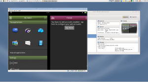
I’ve been interested in MeeGo as the sucessor to Maemo, which I was very pleased with on my N810, and the N9 promo materials imply that Nokia is going to get at least one last piece of nice Linux hardware out before switching to Microsft’s platform. Unfortuanately, it will probably be the last of it’s breed from Nokia, and their handling of support on previous generators of MeeGo has been lackluster at best. It’s also sort of distressing to note that in my experence so far MeeGo is a major step down from Maemo in most ways.
I’d previously tried to make MeeGo 1.1/Netbook work in Virtualbox, and it didn’t go terribly well (the redhat-like Linux system could be coaxed into booting, not so much for the UI layer). When 1.2 came out, I saw that there were tablet UI (but, sadly, not handset UI) images that can be adapted to work with Virtualbox by following these instructions.
The underside of the OS is a Redhat-like (in terms of filesystem layout, RPM packages via zipper, etc.) Linux system, and I got plenty of exposure to it trying to make things play nice with Virtualbox. Frankly, the Debian-derived underside of Maemo was much cleaner and more to my liking, but one POSIX-y Linux platform is enough like any other to make it mostly a non-issue.
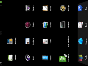
Sadly, once installed it is nearly unusable in it’s current state, both because things are slow and unpolished, and because the interactions with VirtualBox are poor – no gestures, orientation problems, lack of control keys (at least the Super/Windows key is mapped to “Home”).
I didn’t hang on to this one for very long, largely because of the usability issues, and also becuase it isn’t the UI mode I’m interested in (demos of the handset UI on the Nokia n900 and LG GW990 – they look OK but not inspiring). That said, it definately does do a couple things right — there is a terminal in the default installation, and it isn’t bashful about being a real OS with a fancy domain-specific frontend rather than some sort of appliance, which is conceptually the way I wish all these devices would start acting.
WebOS
The other announced gadget that has piqued my interest is the Pre3 (the only problem I see with the announced specs are the lack of removable storage, and it does reasonable UNIX networking and USB host to mitigate), and WebOS is well regarded, but I’ve never actually played with a WebOS device – so I decided I wanted to play with the WebOS SDK (and, more importantly, the device emulator it comes with) enough to make an environment for it. Like most consumer device SDKs, it is made of some little utilities wrapping common FOSS tools. The WebOS tools in particular hook VirtualBox (but only v3.2) and GCC for native app development. That “Only 3.2” matter is a problem – clearly I use VirtualBox quite a bit, and the OS running on the hardware is Archlinux, which tracks current (VirtualBox 4.0.8 at time of writing), so shoehorning 3.2 onto my main system is a non-option. Also, the parts are distributed as Ubuntu-targeted debs, which indicates a hassle running elsewhere. I figured “No Problem! I have the Ubuntu 11.04 in a VM still!”- unfortunately, there aren’t VirtualBox 3.2 packages for Natty, and some of the other quirks were making it harder than necessary, so after about two hours of fiddling and a recovery boot to un-hose the 11.04 VM, I decided it would be easier to set up a 10.04 VM just for the WebOS SDK than try to make it play nice with modern software.
Once I got the Lucid VM set up, installing and running the WebOS tools was amazingly easy, thanks to the unusual situation of the vendor’s instructions just working.
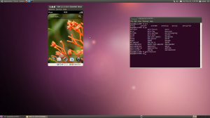
Once up, you are presented with a (slightly broken due to lack of gesture area) UI as it would would appear on a device, and an SSH server listening on localhost:5522 to get into the nice POSIX-y Linux 2.6 underpinnings. The issues of running on a host PC are largely mitigated by good keybindings. The whole system is built with a UI/Native split in mind, and there are a set of APIs for communicating between the parts. It may not be ideal from a development standpoint, but it seems to be fast and provides a very good frontend. Also, if all else fails you can apparently kill the phone’s UI and run an X server when desired.
The vendor provided application catalog is disabled in the emulator, but preware and WebOS Quick Install (whch share a community developed package format work, and those applicatons that have no native code, or i686 builds of their native code install and run normally. Unfortunately, the terminal program uses some native code that doesn’t play nice with the emulator, but it exists and looks more than adequate.
It is worth noting that a centerpice of the UI is a free-form text action box, which can in a context sensitive way launch programs, perform seaches, and various other unrelated activities based on non-command input. Unlike the similar feature in Unity I griped about in my last post, this one is very well implimented, and suppliments the normal hierarchiacal interface rather than ineffectively trying to supercede it.
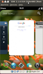
I generally despise the term “intuitive” when talking about UI, but WebOS has a couple features with such logical groupings and physically analogous actions it is hard not to use it. My two favorite examples are the quit action and the messaging features. I couldn’t find the quit action at first, and then irritatedly tried to flick a program “card” (the task switcher is a sort of live-update thumbnail view, which models itself as shuffling cards about) off the screen… which quit the flicked program as intended.
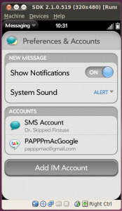
The messaging software also has just the right level of deliniation between modes- the same interface is used for SMS and Jabber, but it is never ambiguous which mode a conversation is in, so you know weather you will be charged (ridiculous) data rates or (even more ridiculous) SMS rates for a particular message. Logically grouped and coherent across analogous tasks, but still transparent to the underlying technology, exactly as it should be.
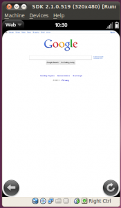
The browser is also really impressive, as are the UI features I tend to test from inside a browser. The browser itself is WebKit-based, has a very fluid scaling/rotation scheme, and supports all the usual plugins (flash, etc.) without too much UI penalty. It also has nice floating/disappearing finger-sized navigation elements. I also found from within the browser that it brilliantly passes one of my favorite “Is this mobile OS reasonable” tests – there is full desktop style hilight/cut/copy/paste editing, with a system-wide clipboard, and sane keyboard shortcuts.
I’m impressed enough with WebOS after using it that I’m pretty sure I’ll try to find a way to get a Pre3 with reasonable service a soon as they appear, despite a history of spotty hardware and clear status as a second-class mobile OS.
This has been more than enough self-indulgent UI rambling for now.


Pingback: WebOS RIP | PAPPP's Rambling