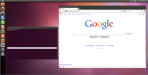
I’ve been playing with virtual machines a lot lately, and one of the more interesting uses was getting to check out the mess that is Ubuntu 11.04 without devoting any hardware to the experiment. In the same spree I have also installed a bunch of the mobile OSes that run on devices slated for release this summer – if I get to it I’ll put up another post about the results of trying to indulge my curiosity about those later.
The short version is “Everything bad you have heard about Unity is true.” Lots of places have taken some time out recently to hate on it, but it is so hatable I just can’t resist. It really reminds me of broken OS X, with even fewer configuration options. I also has lots of things that happen automatically… under circumstances that take some experimentation to figure out: for example, the dock-thing that lives down the left side of the screen (no, you can’t move it) will sometimes side out of view – it has to do with occlusion by other windows, but the circumstances under which it appears and disappears seem almost non-deterministic. The dock-thing also handles large numbers of displayed applications very poorly, collapses extras toward the top with a sort of accordion fold graphic, where they aren’t easily visible. I didn’t catch a picture of it, but it also uses a mac-like “all menu bars in the top bar” scheme, in which it occludes the application’s name with it’s menu in a move reminiscent of the centered apple menu on early OS X builds.
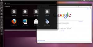
The main menu emerges from an unobtrusive little rectangle in the top left corner, which is part of the dock-thing, not the top bar it occludes. The menu itself is one of those Freeform Search + Icons things that so many platforms have adopted recently – I’m pretty ambivalent about the design in general; well made examples do have a lot of potential in that they hook both “Knowledge in the head” (name of program/task) and “Knowledge in the world” (visual memory for icon, etc.). The problem is they tend to ruin spatial/hierarchal modes by dynamically re-ordering programs under some ambiguous scheme. This one is neither the best nor the worst example I’ve tried to use.
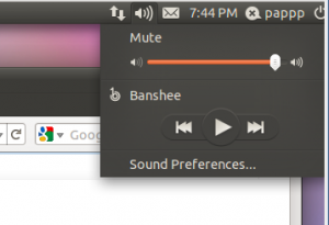
Some familiar desktop interface elements are missing or replaced with less flexible alternatives; for example the system tray appears to be gone – you still get dbus notification popups (for which there is no dismiss button, they just time out when they are good and ready), and fixed-function messenging and media tray objects, but there isn’t a general-purpose tray for tray applets or things like VLC and Pidgin to dock themselves. In a related behavior, I spent about 20 minutes trying to figure out the integrated media player features – a tray-thing for Banshee lives inside the volume icon in the not-a-tray, whether or not Banshee is running, and because of its launch behavior it is really hard to quit Banshee, or even figure out if it is running. It also doesn’t appear to be removable, and there doesn’t appear to be any way to replace it with another media player.
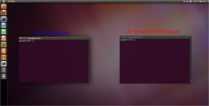
Another thing that combines many of the above problems: the workspace and task switching behavior is actually worse than OS X’s – something I didn’t think was possible. There is no straightforward way to get a window list, anywhere – at best, there is a pip next to each icon in the dock-thing for each active window, which counts over all virtual desktops. If you click the dock-thing icon for an application with multiple windows, it does an exposé-like action and tiles large thumbnails of all the application’s windows in front of you – regardless of which desktop they are on.
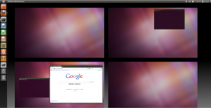
The familiar dynamic “Tiny representation of each virtual desktop” switcher that has been around since the mid 80s is gone – instead, there is an ambiguous static button in the dock-thing, which brings up an exposé-like overview of your desktops. The same view can be summoned up with Super+S. You can at least interact with windows while it is zoomed out to the overview, like you otherwise would in the dynamic switcher.
All these “wonderful” 3d features descend from a common misfeature- the entire desktop is GL. Not composited – GL. Its interactions with other GL programs are fascinating and generally horribly broken. While playing with it I had to kill a glxgears instance because the display corrupted and stopped updating while it ran – there isn’t a GL program simpler than glxgears. I also get some weird GL redraw issues switching in and out of the virtual machine, but that is an interaction, not an intrinsic problem.
There are a handful of good things, in particular, the installer does something very right: once you have given enough input to begin installation, it starts moving things over to the hard disk, and it does everything requiring input up front in one pass, rather than the usual intermittent prompts that cause the installer to stop wait for input. More installers need to do that; keeping state isn’t hard, and stopping at random intervals to prompt for user input is broken. It’s also worth noting that making Unity work in Virtualbox is easy: enable 3D Acceleration in the VM, tap the menu item to install VirtualBox Guest Additions, give the password for the automatic installation script, and reboot. Next time it comes up, you get Unity.
I agree with the idea that computer UI could use improvement; I wouldn’t be looking at it as an area of research if I didn’t believe it was an intresting problem. If Unity were being presented as an experiment, I would be looking at it like E17– not exactly practical, but interesting, and good enough for the dedicated to run full time as part of the experiment. Instead, Canonical has foisted it upon the world as finished software, and set it as the default in the currently in vogue “easy” Linux distribution, and it is totally unacceptable from that perspective.

