Source: Ars Technica
Google I/O 2019 wrapped up on May 9th, but we're still picking through the incredible flood of information that came out of the show. In addition to the slew of announcements on keynote day, there are dozens of hours of sessions and documentation, plus a whole new Android release to pick though. Here are a few highlights from the show.
Android’s gesture navigation is actually good now
-

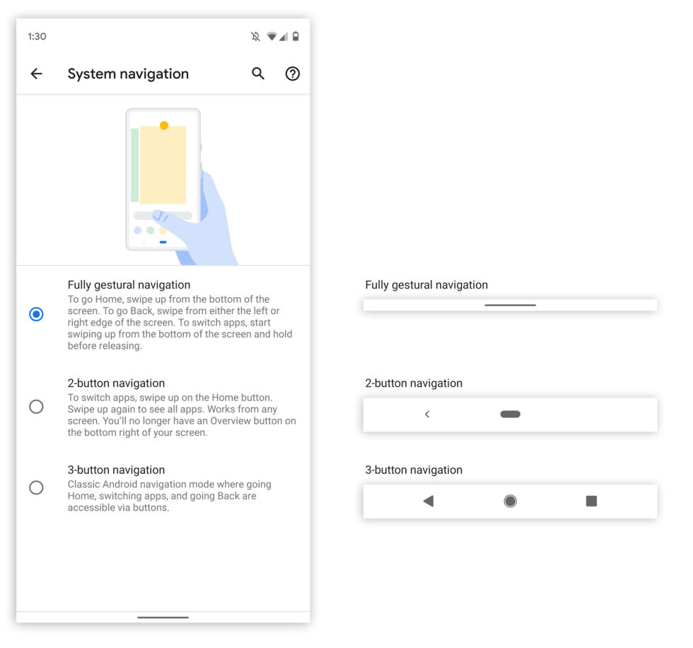
The new gesture navigation settings. On the right is what each navigation bar looks like. The "Full gesture nav" option actually saves space! [credit: Ron Amadeo ]
Every Google I/O presents a new release of Android, and paired with Google I/O 2019 is Android Q Beta 3. There really aren't a ton of changes in this beta release, but there is a new navigation system. There are three versions of system navigation in Android Q Beta 3, actually. The traditional three-button navigation is an option, even on devices like the Pixel 3, which originally did not ship with it. Apparently, the three-button mode will be returning to all phones for accessibility considerations, since the gesture system requires a significant amount of fine motor control. The existing Android Pie gesture system has been renamed "two-button navigation." The third option, called "Fully gestural navigation, "is new for Android Q Beta 3, and it's the best version of Android gesture navigation yet.
In Android P, the "two-button" gesture navigation was a bit of a mess. Google only replaced the Recent Apps button with a gesture, and Home and Back were still buttons. The bar didn't save any space, so there wasn't a huge benefit to using it. Beta three solves a lot of these problems. Every button is now a gesture. The navigation bar has been minimized to a slim strip about a third of the height of the usual bar. Some apps will even give you a fully transparent gesture navigation area. The new setup is very reminiscent of iOS, and that's what everyone has been asking for since the launch of gesture navigation with Android P.

