Tag Archives: UI

Sublime Text 2

The idea of shelling out $60 for a text editor in this day and age is absolutely absurd, but I’m seriously contemplating doing so in the near future, because Sublime Text 2 appears to be the answer to all the things I hate about text editors. I’d been pointed at it before, but don’t like to increase my dependency on proprietary software, so it took a couple passes of seeing it do things right before I was willing to look seriously. But oh how it does things right. I’ve been using the uncrippled demo version for a couple days, and am seriously impressed.

It has all the basic features of a programmer’s editor. It can open multiple files (it uses a browser-style tabbed interface). It syntax highlights almost anything, does intellitext-style autocompletion on pretty much everything, and has shortcuts for context-aware section jumping (brackets/functions/classes/chapters, etc.) and the like. It does all this while remaining fast (startup/execute actions) and responsive (UI), and lives in about 8MB of private RAM — which is to say it is lighter than some of the command line editors I see people using. It also appears to have an excellent pluign framework, because there are a great many available.

One of the things that most frusterates me about programmer’s editors is that they usually do wrong things with shortcuts ingrained into my fingers by every other program I use, which is unacceptable. ST2 uses “modern GUI” keybindings – C+x C+c C+v (cut/copy/paste) all work like they should, as do C+z (undo) C+s (save) and browser-stye tab management like C+w (close tab). Furthermore, all the key-bindings are editable both per-user, and system-wide, as a straightforward format text file accessible from the UI.
While talking about keyboards, I am apparently unusual in that I ride my navigation keys, and ST2 not only binds them, it binds them better than expected. One tap to Home takes you to the current tab level, two taps to the actual beginning of the line. Del deletes, Shift-Del deletes whitespace until it hits text or newline. PgUp/PgDn jump up/down a page, Shift-PgUp/PgDn jump to the top and bottom of the document. The mouse is bound like any modern program, such that selection and scrolling work correctly, unlike most command-line based tools. At least on Linux, both the select and middle click and select, right click, choose from menu copy/paste mechanisms work correctly. It even supports multiple selection and column selection in reasonably straightforward ways.

Another thing that drives me batty about editors is modality. Not only do I not want modes in a text editor that do things other than accept text input, I don’t want modal dialogs that can pop up and eat my text. ST2 has neither (Except for the About window, which is a modal dialog for no apparent reason). Things that might happen in modal dialogs instead happen in either a nonmodal dialog area that appears at the bottom of the window, or (for text-oriented operations) in a input-accepting bar at the top of the window. The top bar does a variety of amazing things, including acting as a launchable, hinting search of the command reference, so if you think of a feature you want, it will tell you if it is available and if there are currently key-bindings for it, or let you use it directly from the search. Imagine Firefox’s awesome bar done right.

It can hook most common build systems (Makefiles and the various language-specific tools).. and like everything, the mechanism is pluggable, so simply dropping a LaTeX plugin in the appropriate place got me C+b to spit out a PDF from my LaTeX document. It detects if these are relevant based on the file and directory, but the automatic choice can be overridden (for cases where you have a Makefile that also generates LaTeX formatted documentation or the like). There appears to be a project managment system that I haven’t even messed with yet, but it apparently works with a pair of human-readable dotfiles in the directory, instead of demanding a particular layout and spewing files like most IDEs.

The search mechanism is also exactly what I always want: it accepts regular expressions, as well as case/whole word switchable simple queries. It does this with obvious controls for direction, and supports highlight all. It also does it across files, with straightforward control over which files are included. As an incredible example of it just being right, a day after I started using it, I needed a “replace preserving case” feature to modify a LaTeX document… I didn’t expect it to exist, but went looking as a “Wouldn’t it be cool” item since it seemed to be wish-granting, and it was not only there, but in the first place I looked on the replace bar – and it did exactly what I expected.

It does some neat things I haven’t seen before. The most obvious of these is that by default it has a tiny live view of the whole document next to the scroll bar, with the visible section highlighted, which is surprisingly useful for navigation. Furthermore, it supports almost every feature I’ve liked from the boneyard of rejected editors. Real-time underlining spell check? Present. Multiple views (ie. two simultaneous views into the same buffer which are kept mutually consistent)? Present. Split-window editing (think Screen/tmux)? Present. Code folding? Present. Bookmarks? Present. Case mangling? Present. Scope marking? Present. I keep finding amazing things, and it isn’t like vim, where you keep finding things because the learning curve is asymptotic. I haven’t even messed with the scripting and macro features yet.

This thing is impressive.

Posted in Computers, General | Tagged , | Leave a comment

Windows 8 DP

I played with the Windows 8 Developer Preview in VirtualBox for a while this evening. Those who spend time around computers will recall that every other Microsoft OS is a loser. The betas for XP and 7 were clear upgrades when they started circulating. They were fast and stable and added desirable features. Me and Vista hit the market like an animal carcass and stunk up the place for a while. They were slow, and fragile, and changed things for the worse. Windows 8 goes beyond that. This shit is the next Microsoft Bob.
The quirks and performance instability can be excused as a developer preview running in a virtual machine. The fact that every UI change from 7 is for the worse cannot.
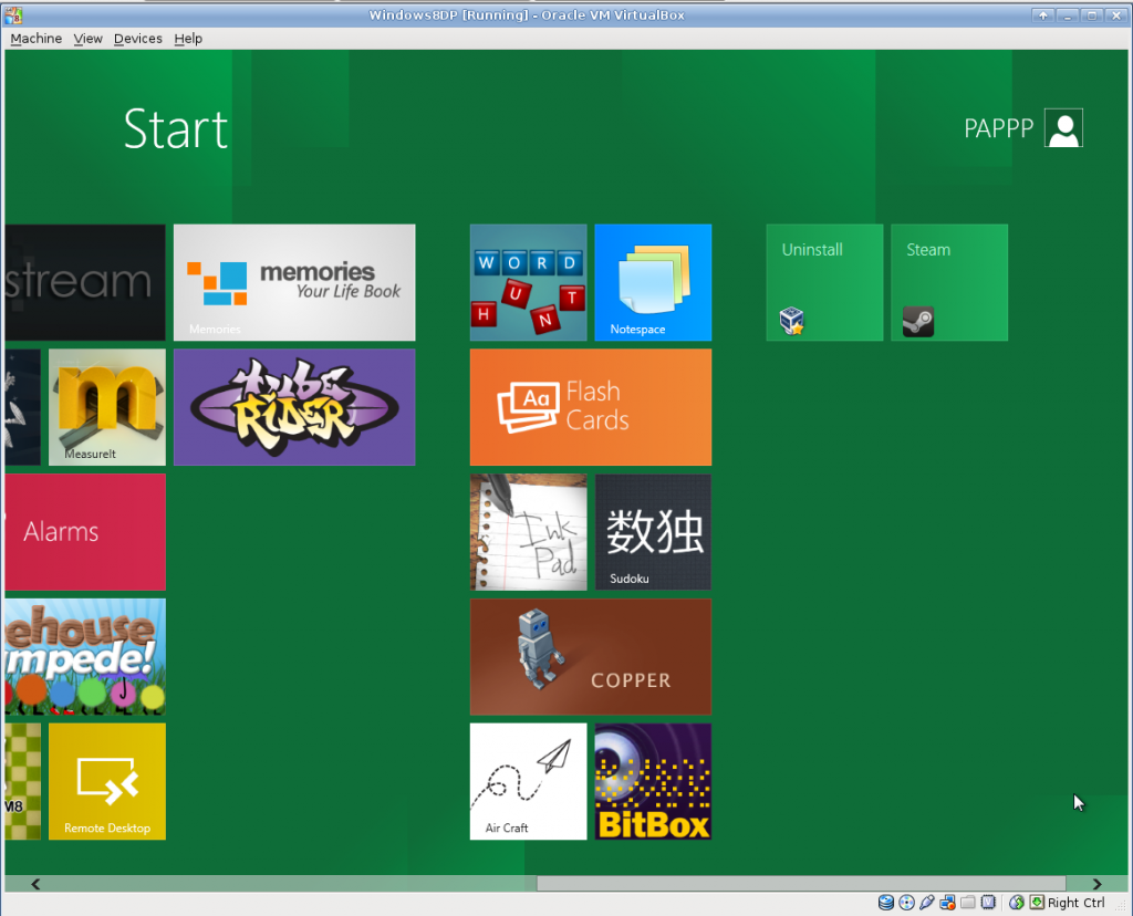
The Windows8 DP Launcher Screen
The big feature is the Metro interface. Metro is trying to graft a mediocre appliance UI (I thought “Cell Phone” a lab mate compared it to their DVD player) on to the desktop, in place of a sane launcher or window manager. The login screen is a “Swipe up to unlock” affair, with no indication that that’s how it works. Finding programs is like sorting through a desk full of business cards. The task model is more akin to Android, where programs suspend to quietly consume resources in the background until swapped out instead of quitting cleanly. All metro apps run fullscreen, one instance per application, and none of the reference apps have any mechanism for tabs or fields. Task switching is performed by hovering near the left edge of the screen and clicking to cycle through active programs (Alt+Tab switches through all active Metro apps, all Desktop apps, and the desktop itself). There is no indication of what is running, so “active” is more than a little unclear. I still haven’t found a mechanism to shut down without first logging out.
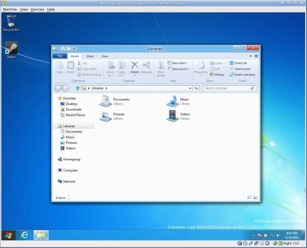
The Explorer Ribbon UI element in Windows8 DP
You can partially drop to a conventional desktop mode, which is much like Windows 7, but a little bit worse in every way. The start menu is GONE – clicking where it used to be just drops you back to the Metro mess. Task management is confusing because some programs are programs, and some programs are entities in Metro. The “hover near the left edge of the screen” switching behavior persists on the desktop. Menus have been replaced by ribbons – which are, I shit you not, 115px high in the file manager. To put that another way, 209px of the default file manager’s 597px height are taken up by static decorations – I’m reminded of those pictures of browsers where the user never turned down a toolbar, but it’s the default style.
Looking for new UI metaphors is commendable, and it’s especially nice to see something other than the “Hide ALL the UI elements!” hyper-minimalism (see the new Google bar) that is the current trend being tried, but this may actually be worse. Users deserve better than the fleet of terrible regressive change-for-change’s sake UIs that have been foisted on the personal electronics world of late.
At least we’ll be making mean jokes about this one for years to come.

Posted in Computers, General | Tagged , , , | Leave a comment

Window Manager Musings

A while ago I installed KDE 4.6 on one of my machines, just to see what the bulky extreme of desktops looked like these days. Mostly, it was obscenely bulky (KDE alone is, seriously, larger than the sum of the software I have on my workstation on campus) and cluttered (what is the deal with that fucking cashew). However, there are a lot of improvements over the last time I fiddled with KDE, and a few features I really, really like.

Some of the little nice things: The control panels are all integrated and aware of each other. The GUI wrappers around randr are genuinely nice (display attachment behavior as good as Windows 7’s – which is frankly the best I’ve ever seen), and the fact that it customizes nicely to CDE-style right-click-the-desktop menus (sans this bug when I first tried) is promising.

The most important (The nomenclature alone for this behavior is nonstandard) is “Desktop Gluing” – Permanently fixing particular windows (or applications, or whatever) to particular virtual desktops. In KDE, a huge array of window behaviors can be set from “Advanced Window Settings” or “Advanced Application Settings” panels obtained by right-clicking the title bar of a window. It’s a good design – unobtrusive until you go looking for it, and obvious once you do. I always keep my “Communication and Identity” stuff (Email, Chat clients, a browser with whatever social things I feel like tending to, etc.) on my second workspace, and this makes it much easier to respond to message alerts without pulling those windows to other workspaces.
Any EWMH compliant environment SHOULD be able to do this, (and apparently E17 has behavior similar to KDE, but E17 has improved from “Broken” to “Useless” over the last few times I’ve played with it, so that isn’t terribly helpful). I can’t find a way to replicate this behavior with XFCE. The native settings don’t have anything, and Devil’s Pie and wmctrl can both cause windows to OPEN on a specified desktop, but they are both extra, somewhat fussy, programs that need to run in the background, and neither can force a window to STAY on a particular desktop.

When looking into the feature, I did make the excellent discovery that XFCE has had a setting for the last several releases that takes care of one of the problems window gluing solves. Based on this Bug Report, one can switch the obnoxious “Pull window to active workspace when activated” behavior to either move focus to the workspace the window is on (My desired behavior), or just alert in the task bar.

Always nice to find little ways to improve the workflow, and see what the other desktop environments are doing, especially with so much of the UI “Innovation” of late being disappointing (see iOS, and Unity).

Posted in Computers, General | Tagged , , | Leave a comment

Apple’s Flatland Asthetic

I’ve found something very offputting about Apple’s much touted UI design since around 2001 (the advent of OS X), and have never quite been able to put my finger on what the issue is, until I came across this series of articles by Bruce “Tog” Tognazzini, the founder of Apple’s Human Interface Group and one of the Distinguished Older Persons of the HCI world. He calls the problem the “Flatland Asthetic”, which he patly describes as “The new Apple seems to subscribe to the the belief that visual simplicity equals actual simplicity.” To put this more aggressively, Apple designs interfaces that are elegant until you use them in non-trivial ways. The biggest way in which this is offensive is where they have actively re-introduced problems long solved by hierarchy in computing, usually by taking away directories (folders. Whatever nomenclature you prefer) in places a consistent interface would allow them. I would also say the problem extends further back that Tog is giving credit for; even the much maligned one button mouse can be explained as an instance of the same ethos.

For some real-world examples, a few days ago I was watching my father use his G5 Tower (OS 10.4), trying to shuffle through a pile of icons which automagically piled themselves one on top of the other in the upper right hand corner of the (shockingly full) desktop, a behavior broken in exactly the same way as Windows 95. He then went to find an application in the dock… which had “elegantly” scaled down to near-illegibility because he had a non-trivial number of applications open or pinned (side-gripe: I still don’t like the confusing commingling of running applications and shortcuts, but with it being in Windows 7 as well now, it looks like I’m in the minority). Generally, any place where the UNIX-derived presumption “Everything is a File, and all files can be manipulated in the same way” is violated, I get unhappy (which explains my contempt for iTunes/iPhoto style “manager” programs as well).

I concede that some of the problems have been remedied, at least a little bit, in the most recent versions of OS X, with features like the the drawers (to use the CDE phrase, I have no idea what Apple calls them) in the dock. I would say these are band-aid solutions over a festering problem with mentality.
I’ve had my (obviously not entirely solitary) rant, now I’ll go back to my customized, bewildering to all others XFCE environment…

* a phrase I’m found of, borrowed from Brian Aldiss and Roger Penrose’s White Mars, the first half (or so) of which is excellent.

Posted in Computers, General, OldBlog | Tagged , | Leave a comment