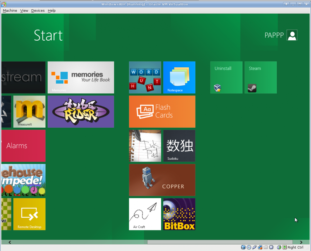
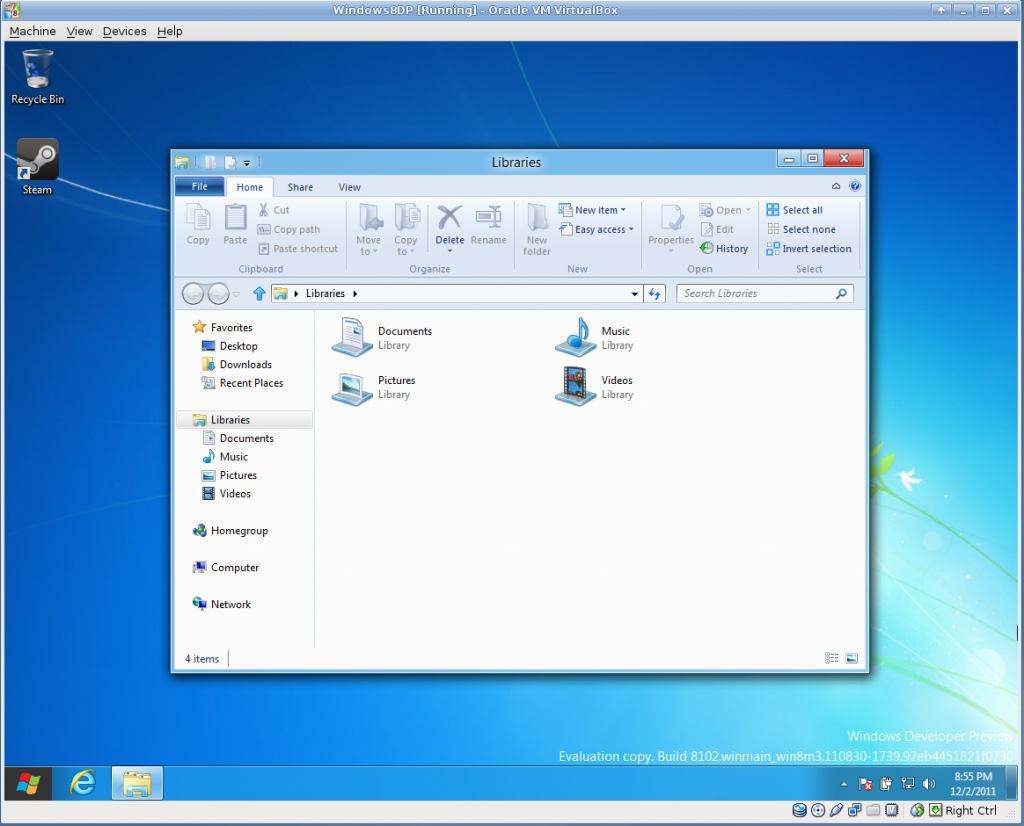
I played with the Windows 8 Developer Preview in VirtualBox for a while this evening. Those who spend time around computers will recall that every other Microsoft OS is a loser. The betas for XP and 7 were clear upgrades when they started circulating. They were fast and stable and added desirable features. Me and Vista hit the market like an animal carcass and stunk up the place for a while. They were slow, and fragile, and changed things for the worse. Windows 8 goes beyond that. This shit is the next Microsoft Bob.
The quirks and performance instability can be excused as a developer preview running in a virtual machine. The fact that every UI change from 7 is for the worse cannot.

The big feature is the Metro interface. Metro is trying to graft a mediocre appliance UI (I thought “Cell Phone” a lab mate compared it to their DVD player) on to the desktop, in place of a sane launcher or window manager. The login screen is a “Swipe up to unlock” affair, with no indication that that’s how it works. Finding programs is like sorting through a desk full of business cards. The task model is more akin to Android, where programs suspend to quietly consume resources in the background until swapped out instead of quitting cleanly. All metro apps run fullscreen, one instance per application, and none of the reference apps have any mechanism for tabs or fields. Task switching is performed by hovering near the left edge of the screen and clicking to cycle through active programs (Alt+Tab switches through all active Metro apps, all Desktop apps, and the desktop itself). There is no indication of what is running, so “active” is more than a little unclear. I still haven’t found a mechanism to shut down without first logging out.

You can partially drop to a conventional desktop mode, which is much like Windows 7, but a little bit worse in every way. The start menu is GONE – clicking where it used to be just drops you back to the Metro mess. Task management is confusing because some programs are programs, and some programs are entities in Metro. The “hover near the left edge of the screen” switching behavior persists on the desktop. Menus have been replaced by ribbons – which are, I shit you not, 115px high in the file manager. To put that another way, 209px of the default file manager’s 597px height are taken up by static decorations – I’m reminded of those pictures of browsers where the user never turned down a toolbar, but it’s the default style.
Looking for new UI metaphors is commendable, and it’s especially nice to see something other than the “Hide ALL the UI elements!” hyper-minimalism (see the new Google bar) that is the current trend being tried, but this may actually be worse. Users deserve better than the fleet of terrible regressive change-for-change’s sake UIs that have been foisted on the personal electronics world of late.
At least we’ll be making mean jokes about this one for years to come.


