Monthly Archives: September 2020

Workers at U of Kentucky concerned about COVID strategies

Source: Inside Higher Ed (news)

Article note: Oh look, we're in the news for our "plan." When they had modality change cut-off with only a few hours notice as the mass-move to online was starting just be fore the semester, it was pretty clear the plan was "retain a maximum number of students until we pass the refund date at all costs." There has only been voluntary testing for the last month or so, and the absenteeism is _drastically_ higher than would be explained by the 4% positivity rate, so my current expectation is that our rates are vastly higher than reported. If we suddenly go remote ~ Oct. 26th (Last day to withdraw), my suspicions will be confirmed, and there should be an external investigation about what the real plan was, because it sure feels like "We need the money and it probably won't kill very many students."

The University of Kentucky has had more employees become infected with COVID-19 since mid-August than any other workplace in Lexington, the Lexington Herald-Leader has reported. At 103 infections from Aug. 13 to Sept. 14, the university has had more employees infected than the next nine employers -- including Amazon, Chik-Fil-A and grocery chain Kroger -- combined. That includes, but is certainly not limited to, faculty.

Workers at the university have said the administration is providing adequate personal protective equipment but not comprehensively carrying out other measures that the state has mandated for businesses.

Kentucky’s Healthy at Work minimums for businesses say workplaces must check temperatures of employees before work or instruct workers to take their own temperatures within 24 hours before reporting on the job. Some workers say neither of those things have happened.

“There’s no temperature checks,” said Donald Moore, a custodian with the university for 15 years. “They don’t tell us to take it at home.”

Matt Heil, circulation staff at the UK Law Library, made a similar assessment. “There’s no temperature check, and they’ve given us no guidelines about anything like that, either.”

“They just don’t mention it,” said Pierre Smith, a groundskeeper at the university.

Despite being the Lexington workplace with the highest number of cases among employees, the university has pushed back against using comparisons with other businesses to evaluate its infection rate.

“I don’t believe the comparison tells you much -- given our size and the amount of testing, tracing, screening and tracking we are doing compared to anyone else,” a spokesperson for the university said via email. “The University of Kentucky is the region’s largest employer -- by far, and so should be expected to have the largest number of positive cases. Without knowing the telecommuting, social distancing, mask, screening, tracing and testing policies at each of these businesses, it is not possible to make a fair comparison across these employers.”

In 2019, the university had 17,500 employees.

The university has also pointed out that it asks employees and students to screen themselves daily through an emailed questionnaire.

“We require everyone who comes on campus to screen. It is based on the [Centers for Disease Control and Prevention]’s algorithm for screening,” a spokesperson for the university said via email, in response to a question about temperature checks. “Further, every student who comes to campus or who lives on [campus] was provided a package that includes a thermometer, two masks, hand sanitizer and other health and safety tools.”

That screener is also part of Kentucky COVID-19 regulations for workplaces. The questions the UK screener asks are mostly in line with, but slightly different from, the ones the state says businesses must ask.

While the state has said every employee should be asked about each symptom of COVID-19 and respond to whether they’ve felt each one individually, the UK screener first asks employees if they are ill. If they answer yes, the survey provides a general follow-up question about symptoms. Other questions on the survey are also slightly different from the state guidelines.

Despite state regulations that say businesses and organizations should allow employees to telework to the greatest extent possible, some instructors at the university have said they have been pressured to teach in person even as case numbers have risen.

Michael McEwen, an M.F.A. student in creative writing, said he originally chose to teach in person, wanting to hold his class outside. But students in his environmental writing class showed some discomfort with that plan, McEwen said, and so after a class vote he decided to instead hold optionally in-person classes once every two weeks.

McEwen was told by a department chair that he needed to increase in-person class time to more than 50 percent of total class hours. Students had paid more for designated face-to-face classes. Otherwise, McEwen said he was told, he could tell students he was evaluating the situation for two weeks, but that the class would eventually be in person. He is now holding in-person classes once per week.

The university has said faculty have flexibility and choice of modality.

“Faculty have discretion regarding the modality in which they teach,” a university spokesperson said via email. “Faculty have been using that flexibility to make quick decisions, in fact, about changing modality when they need to as part of serving their needs and the needs of our students.”

The employee union -- United Campus Workers Kentucky -- has said it has reported the university for noncompliance with state regulations.

Rising Cases

According to local health department data, the University of Kentucky has seen over 2,000 cases among its students on campus. University students now account for 25 percent of Fayette County’s total COVID-19 cases.

On Wednesday, Fayette County was placed in the “red zone” for school reopening, meaning community spread is high enough that public schools must give fully remote instruction and cannot run extracurriculars or sports.

“Our understanding is that the increase in the incidence rate is directly linked to cases among University of Kentucky students,” Manny Caulk, superintendent of Fayette County Public Schools, wrote in a message to families Wednesday. “We have made contact with officials at the University of Kentucky to learn more about whether those cases are within an isolated UK cohort, or indicative of a wider community spread.”

But the university has defended its strategy.

“We have taken a data-driving, methodical approach to our response throughout this process. That hasn’t changed. We’ve followed the numbers and the science and we’ve always acted with our guiding principle in mind -- doing what is best for the health, safety and well-being of our campus community,” a university spokesperson said via email.

The fact that UK students account for 25 percent of total cases in the county is cumulative, he said, and does not represent the impact at this moment in time.

“Also, it is reliant on self-reported enrollment information and utilizes a wide variety of testing sources. Most importantly, positive cases are a function of testing and without normalizing across the various COVID-19 response, screening, tracing and testing policies, it is not possible to compare across entities and make a fair comparison as to whether this percentage is ‘good’ or ‘bad.’”

On Friday, the county health department announced it had 69 new COVID-19 cases for its daily tally. Thirty-one of those cases were college students.

The university has conducted more than 31,000 tests, including mandatory initial tests for students in dorms and Greek life, and has seen 1,300 positive results. The administration has recently launched wastewater testing and randomized student testing, and -- after insistence from the employee union -- is now offering free testing for faculty and staff.

“As demonstrated by our number of active cases, which has largely remained stable over the past several weeks, we believe we are effectively managing the spread of this disease,” the spokesperson said. According to a public dashboard, UK has more than 430 active cases. But seven-day averages for new cases, the university has said, are going down.

The employees’ union has pushed for more from the administration, including hazard pay, affordable health care for staff and a pledge to cover health-care costs associated with COVID-19 for on-campus workers.

Facilities workers, the union has said, are disproportionately Black and at high risk for COVID-19.

“If anybody’s got any chance of becoming infected, it’s us,” said Moore, the custodian, who is 57.

Smith, the groundskeeper, said he’s concerned about catching the virus. He is 54 and his girlfriend uses a breathing machine. He says students don’t always keep their masks on.

“I just kind of stay to myself and stay in a bubble,” he said. “I just don’t talk to anybody.”

Khari Gardner, a senior and the founder of the Movement for Black Lives campus organization, said his group has endorsed the union’s demands.

“It’s getting to an alarming point where UK has to make a decision about how they’re going to move forward,” Gardner said. “It’s starting to affect the community.”

“It’s time for UK to really take a chance and show that they care about the community,” he added. “We’re asking for the university to really take a stand and realize we’re not just numbers, percentages and dollar signs.”

Editorial Tags: 
Image Source: 
Andy Lyons/Getty Images
Is this diversity newsletter?: 
Newsletter Order: 
0
Disable left side advertisement?: 
Is this Career Advice newsletter?: 
Magazine treatment: 
Trending: 
Trending text: 
When Staff Get Sick
Trending order: 
2
Display Promo Box: 
Live Updates: 
liveupdates0
Posted in News | Leave a comment

Color blindness

Source: command center

Article note: This is a _really_ high-quality explanation of color blindness and what it does to your perception (as I'd expect from Rob Pike). May switch to this for explaining to others.

Color blindness is an inaccurate term. Most color-blind people can see color, they just don't see the same colors as everyone else.

There have been a number of articles written about how to improve graphs, charts, and other visual aids on computers to better serve color-blind people. That is a worthwhile endeavor, and the people writing them mean well, but I suspect very few of them are color-blind because the advice is often poor and sometimes wrong. The most common variety of color blindness is called red-green color blindness, or deuteranopia, and it affects about 6% of human males. As someone who has moderate deuteranopia, I'd like to explain what living with it is really like.


The answer may surprise you.


I see red and green just fine. Maybe not as fine as you do, but just fine. I get by. I can drive a car and I stop when the light is red and go when the light is green. (Blue and yellow, by the way, I see the same as you. For a tiny fraction of people that is not the case, but that's not the condition I'm writing about.)


If I can see red and green, what then is red-green color blindness?


To answer that, we need to look at the genetics and design of the human vision system. I will only be writing about moderate deuteranopia, because that's what I have and I know what it is: I live with it. Maybe I can help you understand how that impairment—and it is an impairment, however mild—affects the way I see things, especially when people make charts for display on a computer.


There's a lot to go through, but here is a summary. The brain interprets signals from the eye to determine color, but the eye doesn't see colors. There is no red receptor, no green receptor in the eye. The color-sensitive receptors in the eye, called cones, don't work like that. Instead there are several different types of cones with broad but overlapping color response curves, and what the eye delivers to the brain is the difference between the signals from nearby cones with possibly different color response. Colors are what the brain makes from those signals.


There are also monochromatic receptors in the eye, called rods, and lots of them, but we're ignoring them here. They are most important in low light. In bright light it's the color-sensitive cones that dominate.


For most mammals, there are two color response curves for cones in the eye. They are called warm and cool, or yellow and blue. Dogs, for instance, see color, but from a smaller palette than we do. The color responses are determined, in effect, by pigments in front of the light receptors, filters if you will. We have this system in our eyes, but we also have another, and that second one is the central player in this discussion.


We are mammals, primates, and we are members of the branch of primates called Old World monkeys. At some point our ancestors in Africa moved to the trees and started eating the fruit there. The old warm/cool color system is not great at spotting orange or red fruit in a green tree.  Evolution solved this problem by duplicating a pigment and mutating it to make a third one. This created three pigments in the monkey eye, and that allowed a new color dimension to arise, creating what we now think of as the red/green color axis. That dimension makes fruit easier to find in the jungle, granting a selective advantage to monkeys, like us, who possess it.


It's not necessary to have this second, red/green color system to survive. Monkeys could find fruit before the new system evolved. So the red/green system favored monkeys who had it, but it wasn't necessary, and evolutionary pressure hasn't yet perfected the system. It's also relatively new, so it's still evolving. As a result, not all humans have equivalent color vision.


The mechanism is a bit sloppy. The mutation is a "stutter" mutation, meaning that the pigment was created by duplicating the original warm pigment's DNA and then repeating some of its codon sequences. The quality of the new pigment—how much the pigment separates spectrally from the old warm pigment—is determined by how well the stutter mutation is preserved. No stutter, you get just the warm/cool dimension, a condition known as dichromacy that affects a small fraction of people, almost exclusively male (and all dogs). Full stutter, you get the normal human vision with yellow/blue and red/green dimensions. Partial stutter, and you get me, moderately red-green color-blind. Degrees of red-green color blindness arise according to how much stutter is in the chromosome.


Those pigments are encoded only on the X chromosome. That means that men, who are XY, get only one copy of the pigment genes. Women, being XX, get two. That means that if a man inherits a bad X, a likely result if he has a color-blind father, he will be color-blind too. A woman has two Xs, though, which means that it is much less likely for her to get two bad copies. But some women get a good one and a bad one, one from the mother and one from the father, giving them four pigments. Such women are called tetrachromatic and have a richer color system than most of us, even than normal trichromats like you.


The key point about the X-residence of the pigment, though, is that men are much likelier than women to be red-green color-blind.


Here is a figure from an article by Denis Baylor in an essay collection called Colour Art & Science, edited by Trevor Lamb and Janine Bourriau, an excellent resource.


The top diagram shows the pigment spectra of a dichromat, what most mammals have. The bottom one shows the normal trichromat human pigment spectra. Note that two of the pigments are the same as in a dichromat, but there is a third, shifted slightly to the red. That is the Old World monkey mutation, making it possible to discriminate red. The diagram in the middle shows the spectra for someone with red-green color blindness. You can see that there are still three pigments, but the difference between the middle and longer-wave (redder) pigment is smaller.


A deuteranope like me can still discriminate red and green, just not as well. Perhaps what I see is a bit like what you see when evening approaches and the color seems to drain from the landscape as the rods begin to take over. Or another analogy might be what happens when you turn the stereo's volume down: You can still hear all the instruments, but they don't stand out as well.


It's worth emphasizing that there is no "red" or "green" or "blue" or "yellow" receptor in the eye. The optical pigments have very broad spectra. It's the difference in the response between two receptors that the vision system turns into color.


In short, I still see red and green, just not as well as you do. But there's another important part of the human visual system that is relevant here, and it has a huge influence on how red-green color blindness affects the clarity of diagrams on slides and such.


It has to do with edge detection. The signals from receptors in the eye are used not only to detect color, but also to detect edges. In fact since color is detected largely by differences of spectral response from nearby receptors, the edges are important because that's where the strongest difference lies. The color of a region, especially a small one, is largely determined at the edges.


Of course, all animals need some form of visual processing that identifies objects, and edge detection is part of that processing in mammals. But the edge detection circuitry is not uniformly deployed. In particular, there is very little high-contrast detection capability for cool colors. You can see this yourself in the following diagram, provided your monitor is set up properly. The small pure blue text on the pure black background is harder to read than even the slightly less saturated blue text, and much harder than the green or red. Make sure the image is no more than about 5cm across to see the effect properly, as the scale of the contrast signal matters:


In this image, the top line is pure computer green, the next is pure computer red, and the bottom is pure computer blue. In between is a sequence leading to ever purer blues towards the bottom. For me, and I believe for everyone, the bottom line is very hard to read.


Here is the same text field as above but with a white background:


Notice that the blue text is now easy to read. That's because it's against white, which includes lots of light and all colors, so it's easy for the eye to build the difference signals and recover the edges. Essentially, it detects a change of color from the white to the blue. Across the boundary the level of blue changes, but so do the levels red and green. When the background is black, however, the eye depends on the blue alone—black has no color, no light to contribute a signal, no red, no green—and that is a challenge for the human eye.


Now here's some fun: double the size of the black-backgrounded image and the blue text becomes disproportionately more readable:


Because the text is bigger, more receptors are involved and there is less dependence on edge detection, making it easier to read the text. As I said above, the scale of the contrast changes matters. If you use your browser to blow up the image further you'll see it becomes even easier to read the blue text.


And that provides a hint about how red-green color blindness looks to people who have it.


For red-green color-blind people, the major effect comes from the fact that edge detection is weaker in the red/green dimension, sort of like blue edge detection is for everyone. Because the pigments are closer together than in a person with regular vision, if the color difference in the red-green dimension is the only signal that an edge is there, it becomes hard to see the edge and therefore hard to see the color. 


In other words, the problem you have reading the blue text in the upper diagram is analogous to how much trouble a color-blind person has seeing detail in an image with only a mix of red and green. And the issue isn't between computer red versus computer green, which are quite easy to tell apart as they have very different spectra, but between more natural colors on the red/green dimension, colors that align with the naturally evolved pigments in the cones.


In short, color detection when looking at small things, deciding what color an item is when it's so small that only the color difference signal at the edges can make the determination, is worse for color-blind people. Even though the colors are easy to distinguish for large objects, it's hard when they get small.


In this next diagram I can easily tell that in the top row the left block is greenish and the right block is reddish, but in the bottom row that is a much harder distinction for me to make, and it gets even harder if I look from father away, further shrinking the apparent size of the small boxes. From across the room it's all but impossible, even though the colors of the upper boxes remain easy to identify.


Remember when I said I could see red and green just fine? Well, I can see the colors just fine (more or less). But that is true only when the object is large enough that the color analysis isn't being done only by edge detection. Fields of color are easy, but lines and dots are very hard.


Here's another example. Some devices come with a tiny LED that indicates charging status by changing color: red for low battery, amber for medium, and green for a full charge. I have a lot of trouble discriminating the amber and green lights, but can solve this by holding the light very close to my eye so it occupies a larger part of the visual field. When the light looks bigger, I can tell what color it is.


Another consequence of all this is that I see very little color in the stars. That makes me sad.


Remember this is about color, just color. It's easy to distinguish two items if their colors are close but their intensities, for example, are different. A bright red next to a dull green is easy to spot, even if the same red dulled down to the level of the green would not be. Those squares above are at roughly equal saturations and intensities. If not, it would be easier to tell which is red and which is green.


To return to the reason for writing this article, red/green color blindness affects legibility. The way the human vision system works, and the way it sometimes doesn't work so well, implies there are things to consider when designing an information display that you want to be clearly understood.


First, choose colors that can be easily distinguished. If possible, keep them far apart on the spectrum. If not, differentiate them some other way, such as by intensity or saturation.


Second, use other cues if possible. Color is complex, so if you can add another component to a line on a graph, such as a dashed versus dotted pattern, or even good labeling, that helps a lot.


Third, edge detection is key to comprehension but can be tricky. Avoid difficult situations such as pure blue text on a black background. Avoid tiny text.


Fourth, size matters. Don't use the thinnest possible line. A fatter one might work just as well for the diagram but be much easier to see and to identify by color.


And to introduce one last topic, some people, like me, have old eyes, and old eyes have much more trouble with scattered light and what that does to contrast. Although dark mode is very popular these days, bright text on a black background scatters in a way that makes it hard to read. The letters have halos around them that can be confusing. Black text on a white background works well because the scatter is uniform and doesn't make halos. It's fortunate that paper is white and ink is black, because that works well for all ages.


The most important lesson is to not assume you know how something appears to a color-blind person, or to anyone else for that matter. If possible, ask someone you know who has eyes different from yours to assess your design and make sure it's legible. The world is full of people with vision problems of all kinds. If only the people who used amber LEDs to indicate charge had realized that.


Posted in News | Leave a comment

Google announces crackdown on in-app billing, aimed at Netflix and Spotify

Source: Ars Technica

Article note: Look at that, the abuses of walled gardens civic-minded technologists have been warning about rolling out across the oligopoly. The rent-seeking and censorship aimed at the public at large wasn't something that got acted on, but as soon as it started threatening monied commercial entities, it's suddenly a shitfight with (Apple, Google) vs. (essentially everyone else).
Google announces crackdown on in-app billing, aimed at Netflix and Spotify

Enlarge

With a lot of focus lately on how smartphone app developers are treated on Apple's and Google's app stores, Google has decided right now is a great time to announce more stringent app store billing rules. A new post from the official Android Developer Blog promises a crackdown on in-app billing that sounds like it's targeted at big streaming services like Netflix and Spotify.

Google's post really beats around the bush trying to sugar-coat this announcement, but it starts off by saying, "We’ve always required developers who distribute their apps on Play to use Google Play’s billing system if they offer in-app purchases of digital goods, and pay a service fee from a percentage of the purchase." This rule has not been enforced, though, and a lot of big developers have just ignored Google's billing requirements. Today, Netflix and Spotify don't use Google's in-app billing and instead kick new accounts out to a Web browser, where the companies can use PayPal or direct credit card processing to dodge Google's 30-percent fees.

"We have clarified the language in our Payments Policy to be more explicit that all developers selling digital goods in their apps are required to use Google Play’s billing system," Google continues. "For those who already have an app on Google Play that requires technical work to integrate our billing system, we do not want to unduly disrupt their roadmaps and are giving a year (until September 30, 2021) to complete any needed updates."

Read 7 remaining paragraphs | Comments

Posted in News | Leave a comment

Split Keeb Splits Time Between Desk and Tablet Modes

Source: Hack a Day

Article note: That is a _really_ cool formfactor, that solves both the "Touchscreens are terrible because you occlude your interface" and "Keyboards take up too much face real estate" problems. I like that it exploits qwerty muscle memory (albeit with a little bit of modality for non-alpha keys), IMO only that or a chorder that you can just grip make any sense here. Unusual nicety that it has haptic feedback for its modes, most of those over-complicated layered keyboards are way to silently modal for my taste. Reminds me of things like the (1990s) PARCTab and (2010s) Microsoft Research RearType schemes, which I'm always hopeful will take off because typing on touchscreens is an abomination.

A keyboard you build yourself should really be made just for you, and meet your specific needs. If you approach it this way, you will likely break ground and inspire others simply because it’s personalized. Such is the case with [_GEIST_]’s highly-customized lily58, designed to work in two modes — on the desk, and mounted on the back of a tablet.

The lily58, which is a 58-key split with dual OLED footprints, was just a starting point for this build. For tablet mode, where the keyboard is attached to the back of a tablet with hook-and-loop tape, [_GEIST_] created custom plates that double the thumb keys on the back.

We love that there is a PSP thumbstick for mousing on one layer and inputting keystrokes on other layer. But we can’t decide which is our favorite part: the fact that [_GEIST_] threaded it through the bottom of a Kailh Choc switch, or the fact that there’s a Pimoroni Haptic Buzz with a different wave form for each layer. [_GEIST_] also added an acrylic middle plate layer to support quick-change magnetic tenting legs.

Keyboard mods don’t have to be involved to be adopted by others. This modified Dactyl adds custom wrist rest holders and has deeper bottoms that allow for less than perfect wiring.

Via reddit

Posted in News | Leave a comment

YouTube celebrates Deaf Awareness Week by killing crowd-sourced captions

Source: Ars Technica

Article note: "Low usage" is an an odd angle for discontinuing an accessibility feature, aren't accessibility features "low usage" by definition? Coming at it with something in the vein of "This feature is being used for spam and abuse more than it's intended purpose - also, we think our ML-generated captions are now adequate to cover the accessibility role" would be a much less-distasteful sell. I've seen some speculation that it's an IP thing; lyrics copyrights are ...one of the more repugnant fronts in the IP world... and they could be getting pressure from the "content industry" about that?
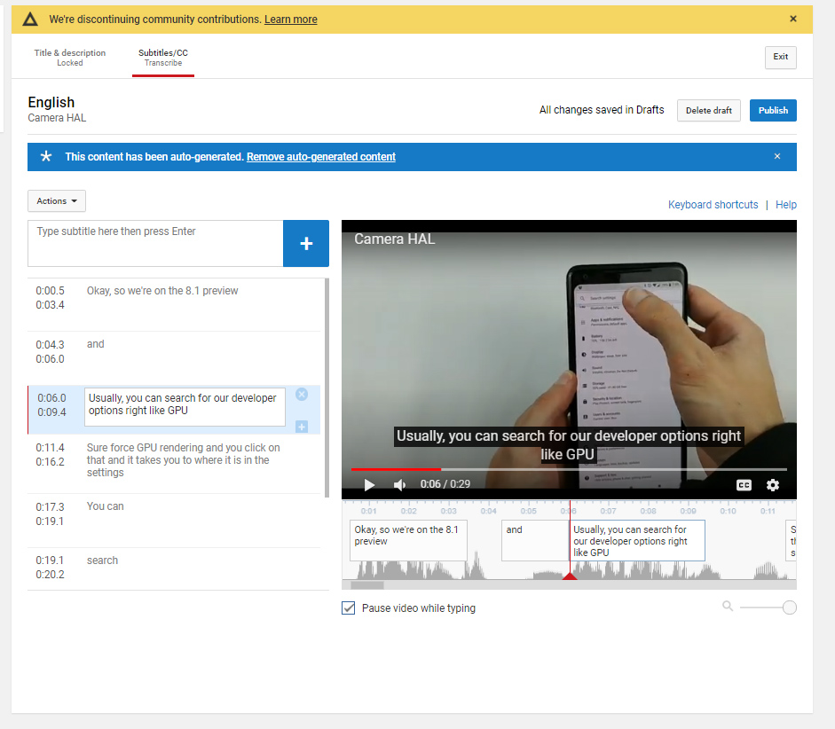
  • Here's what the community caption feature looked like. [credit: YouTube ]

Today's the day YouTube is killing its "Community Contributions" feature for videos, which let content creators crowdsource captions and subtitles for their videos. YouTube announced the move back in July, which triggered a community outcry from the deaf, hard of hearing, and fans of foreign media, but it does not sound like the company is relenting. In one of Google's all-time, poor-timing decisions, YouTube is killing the feature just two days after the International Week of the Deaf, which is the last full week in September.

Once enabled by a channel owner, the Community Contributions feature would let viewers caption or translate a video and submit it to the channel for approval. YouTube currently offers machine-transcribed subtitles that are often full of errors, and if you also need YouTube to take a second pass at the subtitles for machine translation, they've probably lost all meaning by the time they hit your screen. The Community Caption feature would load up those machine-written subtitles as a starting point and allow the user to make corrections and add text that the machine transcription doesn't handle well, like transcribed sound cues for the deaf and hard of hearing.

YouTube says it's killing crowd-source subtitles due to spam and low usage. "While we hoped Community Contributions would be a wide-scale, community-driven source of quality translations for Creators," the company wrote, "it's rarely used and people continue to report spam and abuse." The community does not seem to agree with this assessment, since a petition immediately popped up asking YouTube to reconsider, and so far a half-million people have signed. "Removing community captions locks so many viewers out of the experience," the petition reads. "Community captions ensured that many videos were accessible that otherwise would not be."

Read 1 remaining paragraphs | Comments

Posted in News | Leave a comment

Split Keyboard for Professionals

Source: Hacker News

Article note: Don't care much about the particular commercial offering linked, but in the comments Symbote linked a list they're maintaining with lovely gallery of all the DIY plan, Semi-Commercial, and Commercial split keyboard offerings with links. It's the nicest index I've seen for them. https://aposymbiont.github.io/split-keyboards/
Comments
Posted in News | Leave a comment

New York Times’ Trump Tax Returns Investigation: 18 Revelations

Source: NYT > U.S.

Article note: Yup, he appears to be as crooked and indebted as everyone assumed. Nice that it's getting confirmed.

Times reporters have obtained decades of tax information the president has hidden from public view. Here are some of the key findings.

Posted in News | Leave a comment

How a Pledge to Dismantle the Minneapolis Police Collapsed

Source: NYT > U.S.

Article note: This was the inevitable outcome. That kind of idealistic caught-up-in-outrage sweeping gesture _never_ works, because creating sane policy requires a lot of work and consideration. Dismantling institutions is hard but valuable work, and always comes with the risk that you create opportunities for something worse to take root.

When a majority of City Council members promised to “end policing as we know it” after George Floyd’s killing, they became a case study in how idealistic calls for structural change can falter.

Posted in News | Leave a comment

A Tale of Two Libcs

Source: Hacker News

Article note: It's an amusing take on the absurd complexity of GNULibC vs. the simplicity-maximizing design of musl. ...And then the author linked the Plan9 solution in the comments, which is lovely, and is another piece of evidence that Plan9 what everyone working on systems these days is slowly reinventing badly 30 years after the fact.
Comments
Posted in News | Leave a comment

People expect technology to suck because it sucks

Source: Hacker News

Article note: It's a good point. There's conditioned helplessness. There's 'continuous delivery' making vendors less careful and teaching users to expect inconsistency. There's profit motives to fuck it ship it. There's layers upon layers of poorly understood complexity shifting underneath making things difficult and opaque for users and developers alike. ...And there are no methods that have proven out to even reliably improve software quality.
Comments
Posted in News | Leave a comment