Daily Archives: 2019-01-29

Self-Hosting News Sharing and Discussion

Back in 2013 when google killed Reader I mused about self-hosting my communal news shit-talking.  With the imminent death of G+, which I moved to despite knowing better, I’m looking into it again.  This process might (will) cause some spurious content to appear in the main feed while I try things. I’m still on (and pretty committed to) tt-rss on the news-consumption side, I’m poking around ways of rigging the published feed from that into a comment-able format.  Hopefully with a minimum of work and maintenance overhead on my part, and without hooking myself to yet another platform that won’t monetize well and will thus die.

Success!: The news tab in the nav-bar now takes you to a page that shows the things I publish from my Tiny Tiny RSS instance, complete with a place to yell at me for my hot takes, or share your own thoughts. It’s rigged up with FeedWordPress and a little bit of theme hacking, and can itself be subscribed as an RSS feed. There is a little bit of jank with nested feeds, but at least it’s in house.
A less lazy me would probably do this with a static site generator, a comment system (like isso or something) and some scripts, but I all sorts of don’t have time for that.

Posted in Announcements, DIY, Entertainment, General, Meta | Leave a comment

Google revamps Gmail for Android and iOS

Source: Ars Technica

Article note: Expanses of eye-searing whiteness, with no visual cues for what is interactive. Your design language is bad and you should feel bad.
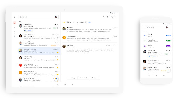
  • The new Gmail. Also, wow, Google remembered that Android tablets exist. [credit: Google ]
Since the launch of Android P, Google has been hard at work rolling out its new "Google Material Theme" design language across all of its products. Desktop Gmail got its big redesign early in 2018, and this week is mobile Gmail's turn. On its official blog today, Google announced the new Gmail mobile design for Android and iOS. We only have a few basic pictures to go on right now, but like every other Google Material redesign, the new Gmail app is best described as "white and round." Google's new design language uses the stark white Google.com homepage as inspiration, so its new apps are almost entirely devoid of color. The big red header from the old Gmail app has been swapped out for a white search bar, so the only touches of color are from contact pictures, labels, and attachments. Besides the new color scheme, Google says you'll be able to "quickly view attachments—like photos—without opening or scrolling through the conversation." The top search bar promotes search more, and it also houses your profile icon on the right side, which lets you change accounts faster.
Read 2 remaining paragraphs | Comments
Posted in News | Leave a comment

“Learn to Code”: The Meme Attacking Media

Source: Hacker News

Article note: I have to say, I think this one is pretty funny, in a "turnabout is fair play" sort of way. Media outlets have been doing the "Your career is obsolete, find a new one, learn to code, that won't collapse like the rust belt" thing to the various blue-collar bases they find to condescend to, being told it as their industry collapses from at least a decade of management decisions and cultural drift ('member "pivot to video"? 'member the 3mb of ads and spyware the average news pageload tries to download? ) seems in keeping.
Comments
Posted in News | Leave a comment