Source: Ars Technica
Article note: Expanses of eye-searing whiteness, with no visual cues for what is interactive.
Your design language is bad and you should feel bad.
-
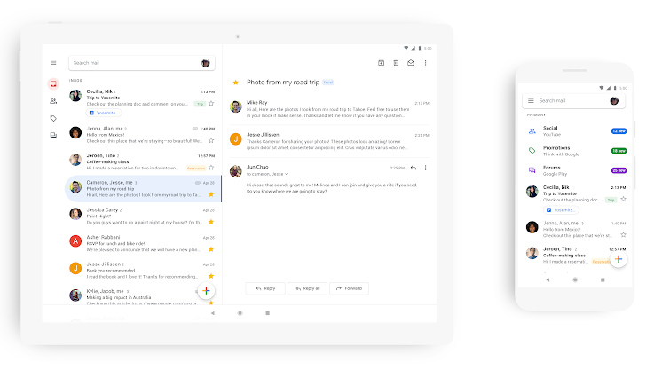
The new Gmail. Also, wow, Google remembered that Android tablets exist. [credit:
Google ]
Since the launch of
Android P, Google has been hard at work rolling out its new
"Google Material Theme" design language across all of its products.
Desktop Gmail got its big redesign early in 2018, and this week is mobile Gmail's turn. On its official blog today,
Google announced the new Gmail mobile design for Android and iOS.
We only have a few basic pictures to go on right now, but like every other Google Material redesign, the new Gmail app is best described as "white and round." Google's new design language uses the stark white Google.com homepage as inspiration, so its new apps are almost entirely devoid of color. The big red header from the old Gmail app has been swapped out for a white search bar, so the only touches of color are from contact pictures, labels, and attachments.
Besides the new color scheme, Google says you'll be able to "quickly view attachments—like photos—without opening or scrolling through the conversation." The top search bar promotes search more, and it also houses your profile icon on the right side, which lets you change accounts faster.
Read 2 remaining paragraphs |
Comments