Article note: It's like the entire fuckin' industry decided to make things that look pretty instead of things that work well for the last 20 years.
We _know_ how (extended) Fitts' law works: things in the screen corners are the easiest to select because they have "infinite" depth in two directions, and edges are slightly harder with 1-d infinite depth, so you put your common controls there...so they move UI elements to be centered. (remember the early OS X demos with the centered Apple menu? Even "you're holding it wrong" Apple backed off on this kind of dumb shit).
We _know_ that consistent placement and appearance allows for "muscle memory" ... so they make shit that constantly moves, re-flows, and alters its visual presentation every time you see it.
We _know_ that multiple monitors and odd (especially ultra-wide) device aspect ratios are increasingly common... so they remove features for accommodating them.
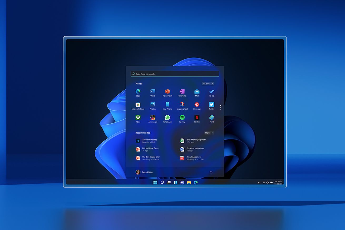
Microsoft promotes itself as the productivity company, but the new Windows 11 taskbar removes key functionality and makes me less productive as a result. Missing features include power user elements like displaying the time and date on multiple monitors, or simple things like having small icons and being able to move the taskbar around. There’s so much missing here that I’m stunned Microsoft is shipping a new OS that takes the Windows taskbar back decades.
While this missing functionality initially seemed like bugs or unfinished code, it’s clear Microsoft now intends to ship the taskbar like this on October 5th. I personally use three monitors on my PC, and if I’m using a fullscreen app or a game on my primary one, I can’t see the date...