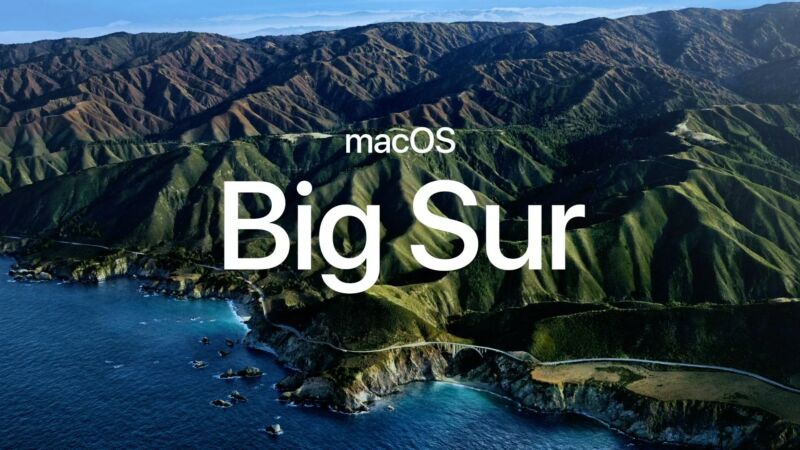
Source: Ars Technica

It's WWDC, and today Apple is announcing the next big version of macOS "Big Sur," which, after 15 versions of "OS 10.x," is actually version 11! Big Sur, like the previous versions, is named after a region in California.
Apple says Big Sur comes with an "entirely new interface" with "refinements in buttons and controls" and a new unified icon yet. Finder and most other apps feature a more transparent, top-to-bottom sidebar with an all-white (or all-dark) main section to the right. Toolbars have been redesigned, with the big gray window topper of previous versions getting the boot.
Control Center has arrived on the Mac, too. Clicking on the toolbar by the time will bring it up, just like the notification panel. Inside, you'll find sliders for the volume and display brightness, along with other power controls and media playback. You can drag controls into the status bar for quick access. Widgets have been reworked with a gallery display view, and you can easily drag them into the side widget bar.

